Diamond Rally
How do you design a brand meant to streak by on supercars going full throttle? It has to be bold, unmistakable, and unforgettable—built to turn heads in the split-second between a glance and a blur.
Industry
Automotive
Location
Vancouver, Canada
Services
Brand Development
Brand Positioning
Print Production
Creative Solutions
The Project
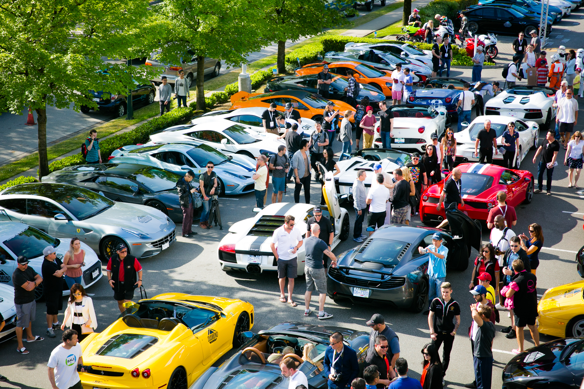
Diamond Rally, an exclusive charity event featuring high-end supercars, brings together a unique mix of luxury, community, and social impact. Every year, participants hit the breathtaking Sea-to-Sky Highway for a thrilling journey, blending style with a cause. As the event gained prominence, Diamond Rally needed a brand that not only resonated with the elite nature of its audience but also symbolized the adventure and camaraderie on the open road. The goal was a memorable, visually striking identity that would amplify its prestige and purpose.
The TWYST
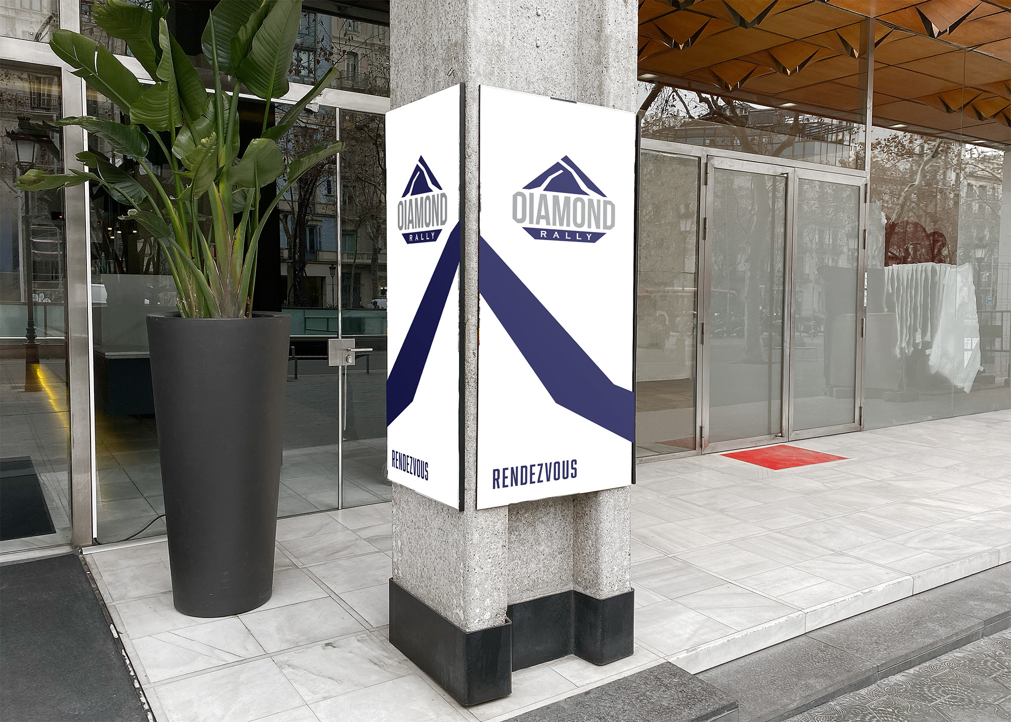
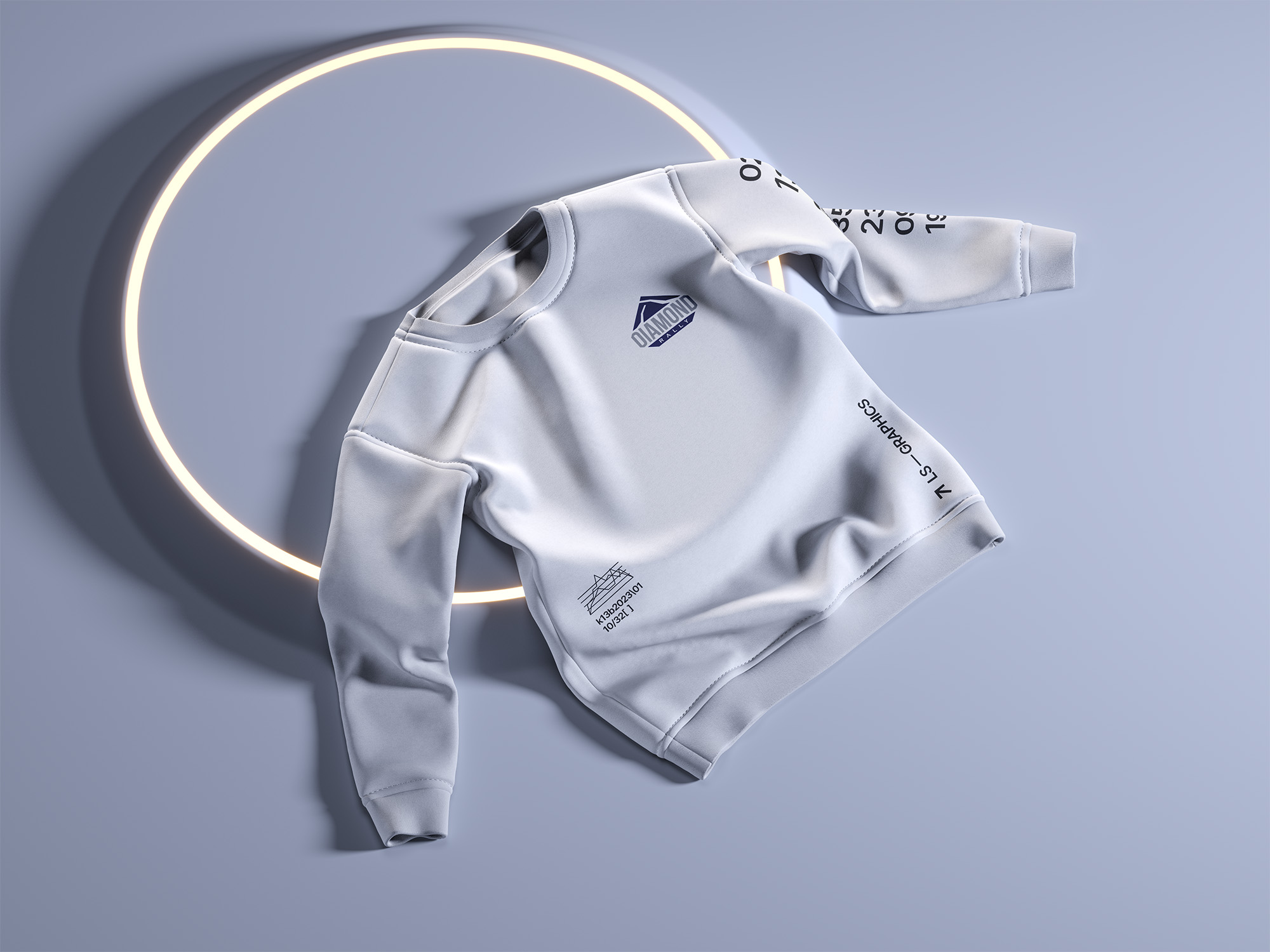
We took on the task with a clear objective: to build a brand identity that reflected Diamond Rally’s high-octane energy, elegant community, and scenic journey. We worked on a streamlined logo that encapsulated these ideals, combining sleek modernity with boldness. Using colors that evoke strength and sophistication and a logo mark inspired by the dramatic landscapes, we aimed to capture the essence of the rally. Each design decision underscored the rally’s aspirational nature, connecting seamlessly with participants and spectators alike.
The Solution
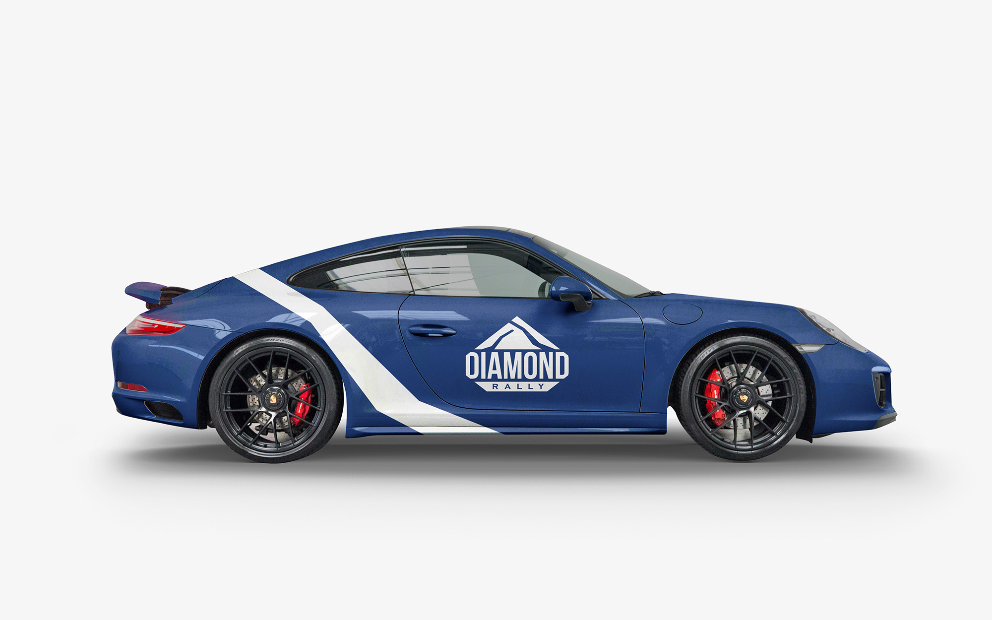
At the core of our approach was a distinctive diamond shape, strategically turned to symbolize direction, ambition, and refinement—qualities at the heart of Diamond Rally. Bold, angular lines suggest the rally’s winding routes and adrenaline-charged experience, while dynamic, deep tones bring a sense of elegance and intensity. This new identity honors the rally’s exclusive community and enhances its status as a hallmark event, making the brand as striking and exhilarating as the rally itself.
