Miracles
Sport brands need to hit the sweet spot between boldness and dynamism, weaving simplicity with a dash of emotion. From apparel to signage, the real challenge is finding that perfect balance while elevating the team’s story to legendary status.
Industry
Sports and Entertainment
Location
Vancouver, Canada
Services
Brand Positioning
Brand Design
Print Design
The Project
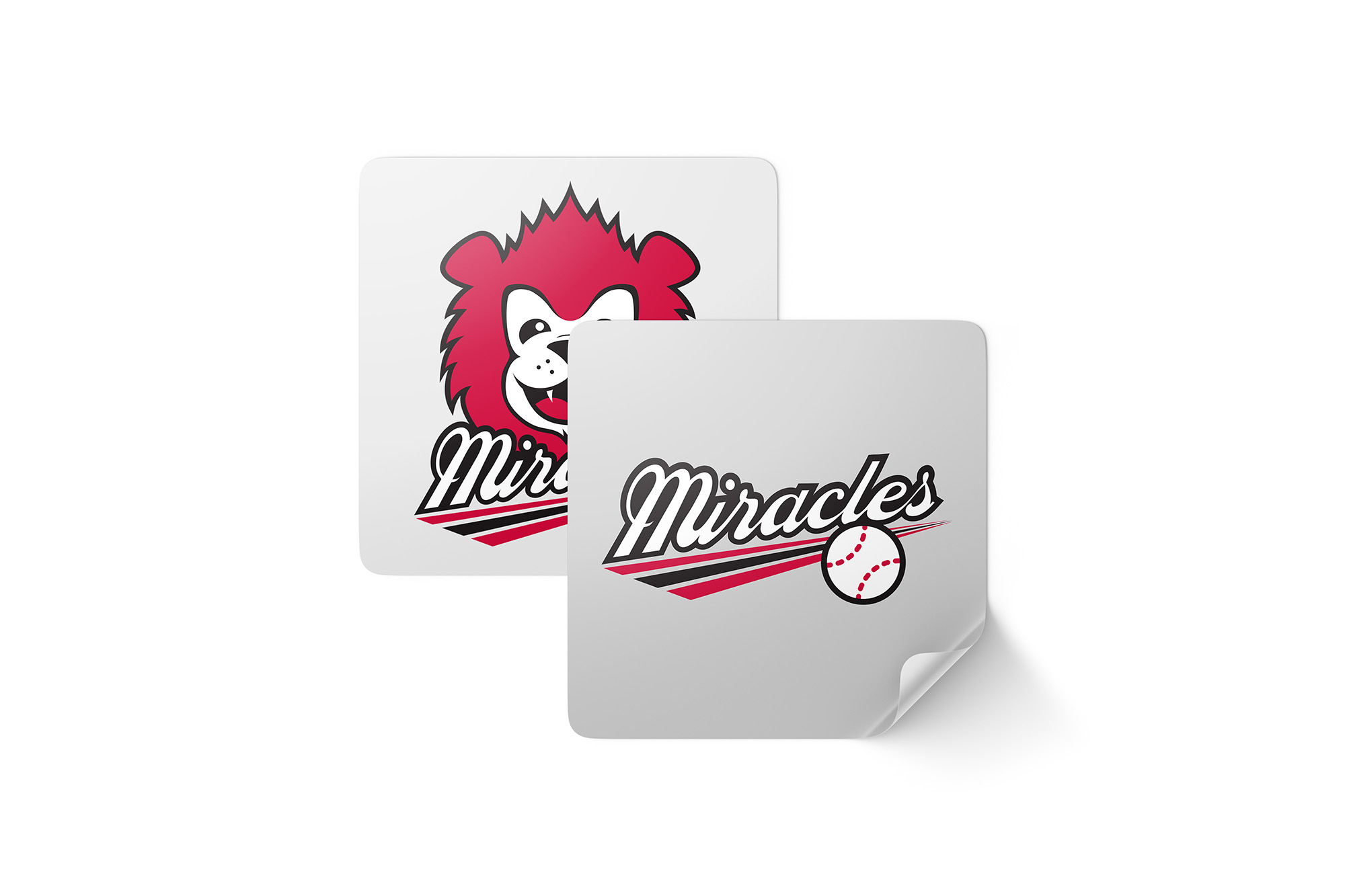
The Miracles softball team aimed to elevate its brand identity, focusing on capturing the power, pride, and sense of community that define their culture. With a deep commitment to athleticism, the Miracles sought a logo that would embody both their passion for the game and their spirit of unity and resilience.
The TWYST
Our creative direction was inspired by Japanese team logos, known for their boldness and artistry. To create a brand that felt authentic, we focused on the team’s personality, exploring their history and ambitions. We immersed ourselves in their culture through interviews, practices, and close observation to capture their unique energy and dynamics. The design combines bold lines, angular shapes, and a striking color palette, translating the Miracles’ strength and drive into a modern, timeless visual narrative that reflects their intensity and purpose.
The Solution
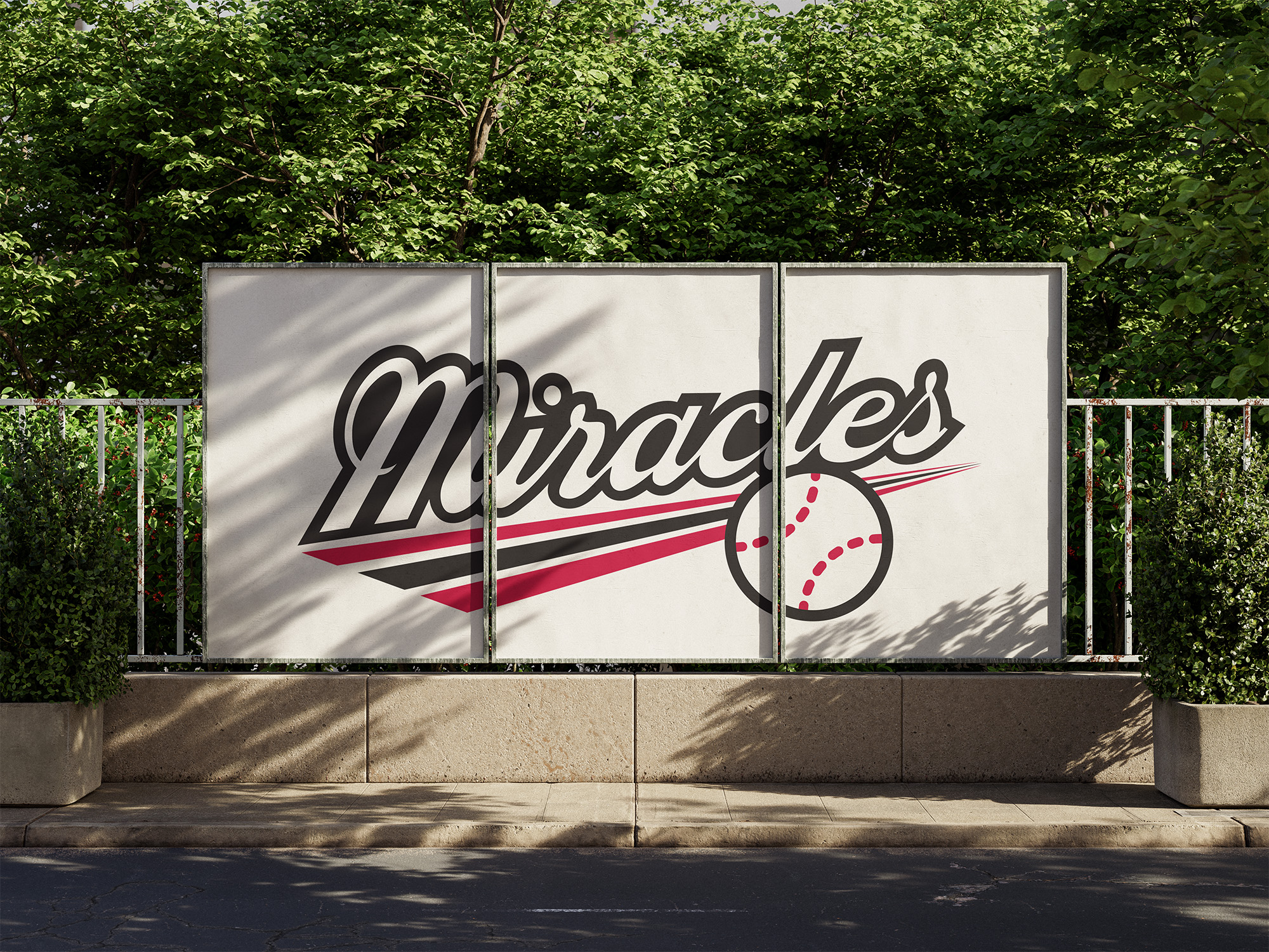
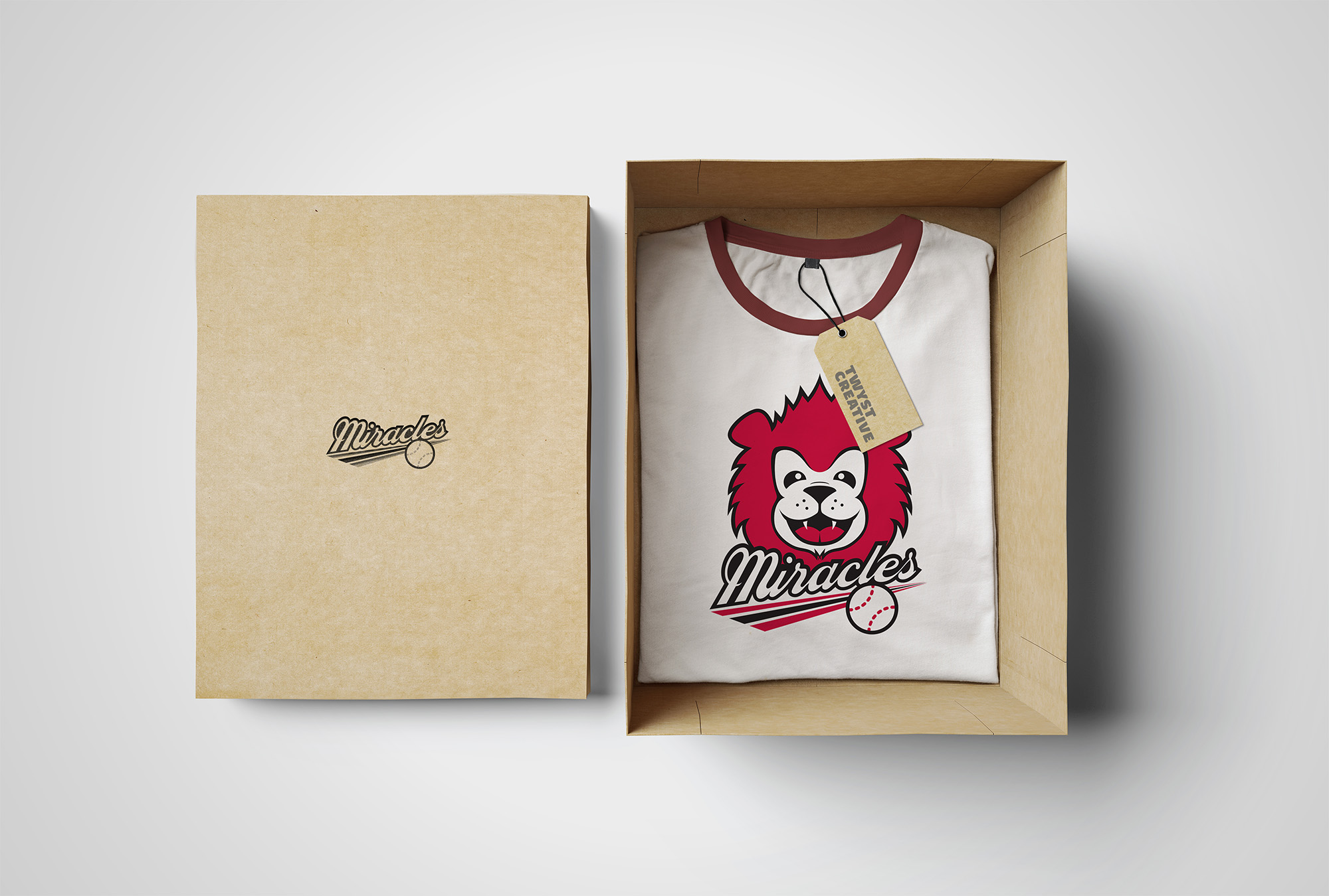
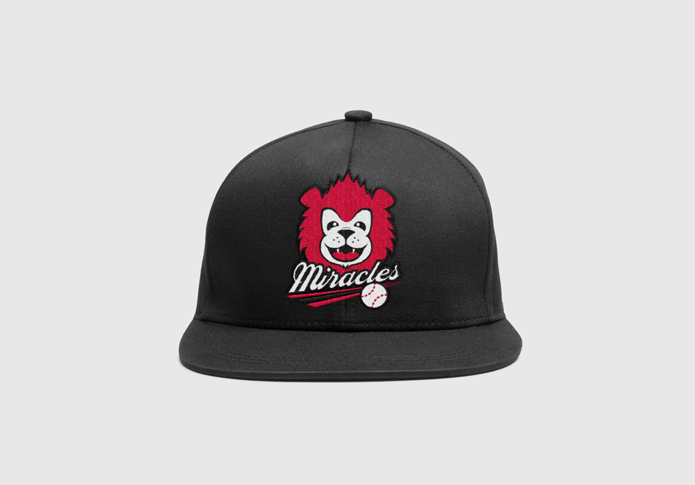
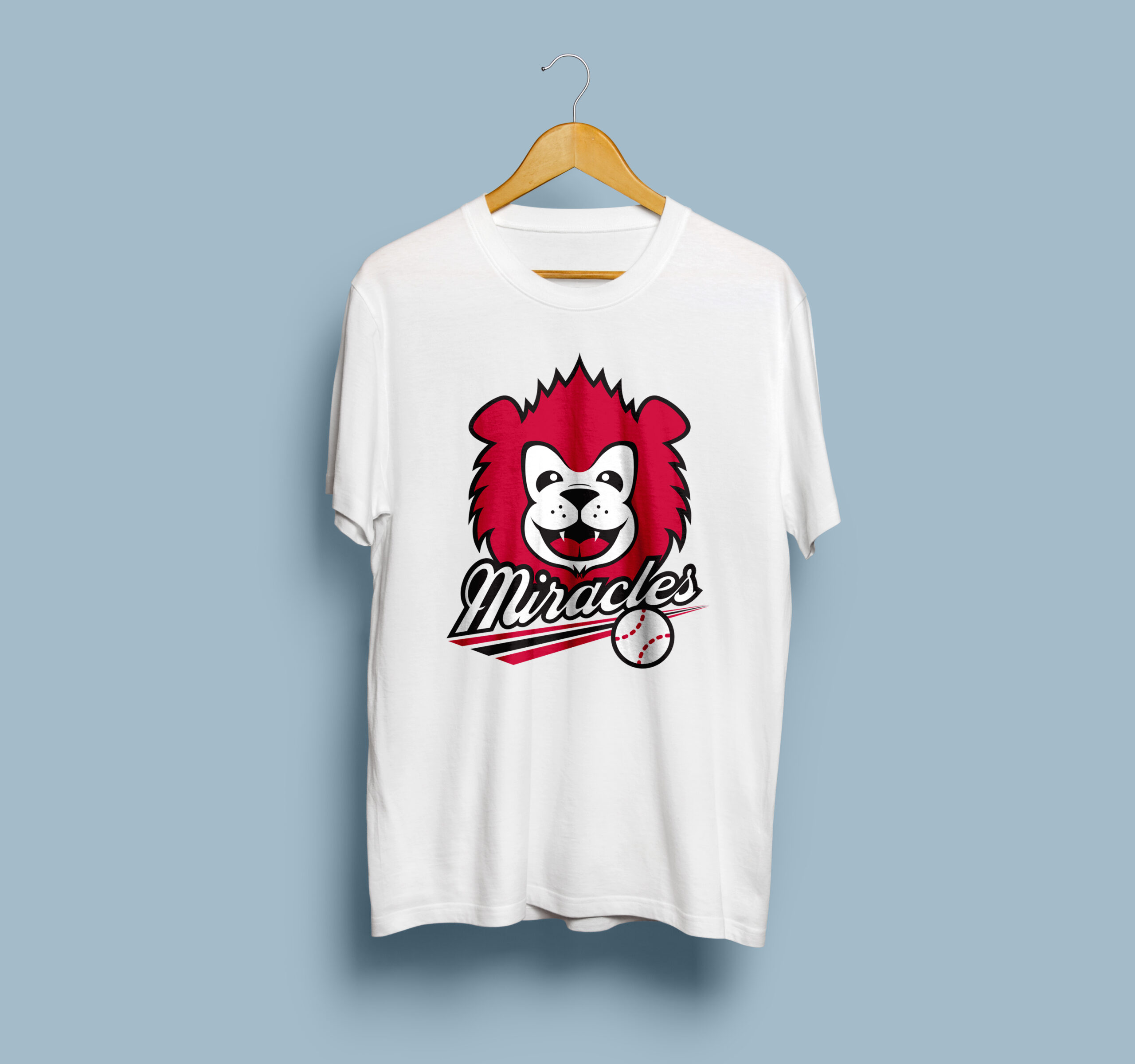
The resulting Miracles logo is more than an emblem—it’s a statement of strength and solidarity that resonates across every medium. Built to stand out in both digital and physical formats, it translates seamlessly from jerseys and signage to social media and team merchandise. The design’s adaptability ensures the Miracles’ brand remains memorable and impactful, enhancing their identity not just as athletes but as symbols of resilience for their community.

